V-Neck Shirt By American Apparel

Remember how I did a post of the American Apparel Reglan shirt awhile ago, basically professing my love for them and acknoledging that I had worn them almost everyday last winter and realising I should probably buy new shirts? Well, now that it's summer, I can't really go around wearing the Reglan shirt -it's simply too hot. So not surprisingly, I decided to try out one of AA's oh-so-popular V-neck tees.

We all know that AA is really popular for it's deep V tee, but seriously, the V is so deep that I can't say I actually understand why people even feel comfortable wearing it casually (or not casually.) What's the point of a basic, boring tee if it's not comfortable and I have to spend the whole day pulling my shirt up?

So I stuck to the basic V-neck tee. Before trying on the tee, I imagined that an AA V-neck tee would magically transform my outfit to look cool and all, like you know how it always looks cool on whoever's wearing it in the photos you see in paparazzi or candid fashion photos? Alas, from what I could see in the AA changing room mirror, the tee totally did not make me look any cooler (not surprisingly I suppose.)
The coolest way to wear the AA tee is probably with skinny jeans or denim shorts -they really create a more unisex, effortless feel. Although admittedly, I've been wearing the tee with a denim skirt. And after wearing this outfit a few times, I'm really appreciating how brainless the combination is! (Brainless-ness is clearly one of the key factors to my favourite outfits.)

And yes, I realise the AA tee is totally last year's news, (or maybe even news from the year before,) but hey, at least I'm learning to appreciate this boring (but very useful) basic tee now.

Image Credit: www.americanapparel.net

Design a Coach Tote

Over at Coach, they are having a design a Coach tote competition where the winner gets their tote made and win a shopping spree of $2500 along with many other Coach goodies. Talk about a great opportunity!
These two designs are currently ranked the top two. Personally, I think it's been rigged. Because I don't see the appeal. The Penguin design, Born with Style, is cute and I like how they put the Coach C's. But the penguin print just seems kind of random. It's not exactly what I'd say very cutesy, but at the same time it is definitely not serious. It's just somewhere in the middle. And the purple bag, Hot Pink Summer... I think it's fairly obvious why I wouldn't be caught wearing that.
I admit, I didn't personally go through all 3279 entries, but here are a few of my personal favourites. You can never go wrong with black and white, and I think these two, Classic B&W and Skyline Inverted, are no exception. They are both classic and chic. Obviously I have very consistent taste since both are really similar, but the black and the white and the bow just goes so well together! The one with the silhouette of the Coach is more distinct, but then the city skyline, while a bit too bunched together, appeals to my city girl side.
Of course, it is not lost on me that they're looking for a 'truly inspired and unique' design and even I know that those are not. Other bags that caught my eye were these two, Chic in Pink and Falling Leaves. I love the pink stripes and the color combination, it is all very sharp and bold. Falling Leaves on the other hand is simple and subtle. But then doesn't both of these remind you a bit of Anya Hindmarch designs? No?
I also rather like these two here, Munchkin and Swirl Pattern. They are both just so.... pretty! With their quiet and feminine color palette and elegant design, I'd definitely consider wearing these two.
And that is high compliment indeed, because designing a tote is not just about splattering on a pretty designs. Witness these two here Dark and Coach with a Twist.The designs by itself are really quite pretty.But in reality, it doesn't really translate well. The fading silver is a good concept in 2D, but in 3D I think it'll be a bit too much. And while the swirly idea is good and simple, I just don't it'll look really classy in real life.This is why this Classic Black and White is my absolute favourite. Fine it is not exactly that far off from the first two I posted, but I think the huge sunflower print over the subtle Coach prints and the 'Coach' squiggle makes all the difference. It is different, unique and yet still very Coach. And I'd definitely wear it! Pink Lilies is also not bad. On first glance, it looks like just another bag with a pretty print. But then the designer has cleverly put in the Coach element on the butterfly and I think that's really cool.
Then there are the super cutesy totes. Clearly these are meant to be cutesy. But there is a fine line between looking cheap and cutesy. But I think these two designers have achieved the right balance. The Juicy and the Bunny tote are just adorable. The first one is completely unique, with the bold graphic print of the cartoon, but the over cutesiness is countered by the subtle Coach prints in the background, which is very neat. The bunny cartoon on the other hand is just the perfect compliment to the Coach print. The silhouettes is simple and not very colorful, so it is not over the top. And yet it is still very cute. Juicy is a little too bold for me, but I'd definitely carry the Bunny. It's cute without being too immature and kidlike (at least not matched with the classic print!).

I must say, I'm very impressed with the selection. What computer program did everyone use to create these really real looking bags? (seriously, they look like photographs!). Which ones did everyone else liked best?

The competition is now closed, but you can still support your favourite design by voting for them on the site (I think you have to sign up for Brickfish though...)!

Image Source: Coach

08 Trend: Gold Eyeshadow -The Smoky Eye

So while finding the runway photos on style.com for the Pure Gold post, I realised that the gold eye shadow look that has been in my mind wasn't really the Bottega Veneta S/S08 look but it was the very different Versace S/S08 look: the smokey eyes.

For a light smokey eye, go for the Zac Posen S/S08 way.
You can see that there's obviously yellowish-gold eye shadow in the inner corners and on the bottom lashes. As for the top outer eyes, the brown eye shadow is applied in a 'wing out' way, which may look cool on the models, but I imagine very hard to apply on yourself in real life -the winged shape is so hard to acheive!
For something more smoky and made-up for a night out, try the Versace S/S08 way. The Versace 'face' is definitely one of my favourites this season. It's pretty do-able in real life, (as long as you don't expect to look 100% like it does in the photos.)
For an imitation of this smokey eye, just blend gold and brown on your eye lids.
Try this: Mac's Goldmine + Tempting. I've never actually tried tempting, but I'm guessing most shades of shimmery brown would be ok.
Pale lips seem to be the way to go, although for some odd reason, pale lips never seem to look as cool in real life as in fashion magazine photos.
Picture yourself in this makeup for a night out -loves it!

Ralph Lauren at the Beijing Olympics

It's the opening of the Beijing Olympics today! Granted I'm not much of a sporty person myself (my idea of sports is walking/shopping), I can't wait to see the opening. Not only because the performances at the opening ceremonies are always really amazing, but also because I can't wait to see the outfits of the US team! I always have the impression that the opening outfits are very old fashioned and not very flattering. But this time, designed by Ralph Lauren (how much more American can they get?), it should be much more fitted and elegant. In the mean time, let's take a look at the Ralph Lauren Olympic collection.
Usually I'm not too excited. They're almost always very touristy and looks more like an advertising campaign than anything. This hat is no exception. I can totally picture an American tourist with a big camera wearing it.
The polo with the Chinese characters saying Beijing is ok. But I can't help but think that these two tops are something I can grab from a tourist shops in Beijing. You know, the tops with the name of the city emblazoned on it, that can be found in any tourist shop in any city... this is especially so for the red top.
They do however, have something a bit more subtle, like these two polos. They're quite cute, but then again nothing that out of the norm for a RL polo. So where is the happy medium between too touristy and too subtle?
These tops. I'm loving these RL polos. The trimming and the stripes are genius. They are patriotic, very Olympic yet stylish. For one thing, I'd actually wear these out in public- even after the Olympics!

Let's see if RL maintains this happy medium for the opening ceromony.... in 8 hours!!

Image Source: Ralph Lauren

08 Trend: Gold Eyeshadow -Pure Gold

In an attempt to 'live young', I looked into fashion magazines for this season's beauty trend in search for eye shadow ideas, as opposed to my usual eye shadow style (the few times I bother with eye shadow;) Read: brown. If you read every magazine out there for a few months, you would realise that they feature eye shadow of every colour so I ignored the obviously magazine-styled ones, like many shades of green, yellow and blue, and have decided to accept the classy trend: the gold eyeshadow. There are two types. The first one is pure gold.

As you can see, pure gold basically means just plain gold all over the eye lids. The looks above are from the Chanel F/W08 runway show. Obviously I don't recommend you actually taking this look literally in real life.

Another show that had all gold eye shadow was the Bottega Veneta S/S08 show. Here, it looks simple and elegant -perfect for day and night.

A closer look on the eyes. While it looks very effortlessly applied on, I'm sure we wouldn't be able to replicate it quite as well in real life.

The way I'm planning on trying out this look is to first adjust by dabbing a tiny bit of the gold just at the inner corners of the eyes, so it will look as it does in the image above. Just a tiny dab to add a little something to the otherwise plain (but equally elegant) look. After trying it out a few times, I'll move on to try the all-gold look (like in the other Bottega Veneta images, not Chanel!)

So I headed to M.A.C. and found this colour: Goldmine. The makeup lady applied the colour all over my eyelids and honestly, it looked more like sparkly yellow than the pure gold in the Bottega Veneta show. But since it usually takes me a very long time to accept new makeup colours on myself and I wasn't bothered to search for the perfect gold, I just picked a Goldmine up. It's something for me to look foward trying on my next quiet night out.

I'll blog about the other gold eye shadow look soon! Thoughts about this gold look?

Image Credits: http://www.elle.com/, http://www.style.com/

Ipod Classic Cases

When it comes to music players, I'm not exactly the most up to date girl around. My music players never break. My Sony MD player from back in the days when people knew what MDs were, still works. And thus, as the world moved on with colored screens, nanos, videos and touches, I was still using my ipod mini v2, with its measly 6GBs and black/white screen. After 3 years though, the battery in my mini finally showed signs of giving up and I can finally get a new one. After much debate between the pink nano (cute and adorable!) and the classic ipod (the itouch is too big, if I was going to get that, I might as well get an iphone....), I settled on the classic, figuring that I can outfit it however way I want- thus this post.
My first thought was just to get a regular silicon plastic case like the one I had for my mini-except maybe this time I'd be more "adventurous" and try a colored case instead, like these ones above. It comes in packs of three and I love ALL the colors in the packet- I can literally help my ipod change clothes like a Barbie!
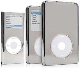
But then, just as I was about to grab them and leave, this retro pink acrylic case caught my eye. A few days before, I wasn't even aware that ipod cases came in acrylic, until I saw my colleague's ipod encased in them. But then I thought, maybe it was time to try something new and fun, and this was definitely it. And that was how I ended up with this case. Once I got home, I googled up the reviews and concerns were raised. Apparently these acrylic cases don't exactly fit like a glove and will potentially scratch the very pretty, currently scratch free and pristine surface of my new ipod. The want to protect and keep it as clean and new as possible arose, but was quickly squashed by my mom's voice in my head going, "if you're not going to use it because you're worried it'll get dirty, then don't buy it." Words from a wise lady indeed. You might wonder why I didn't choose a gorgeous designer ipod case or one of those super cute ones that keep on popping up on Shiny Shiny- I'm of the opinion that designer ipod cases are unnecessary and that an ipod should look like an ipod and not disguised as a fluffy stuff toy. One ipod case I DID like from Shiny Shiny though, are these Griffin Reflect cases. They're basically mirrors encasing an ipod and when your screen it turned off, it too becomes an reflective surface! Perfect to double as vanity mirrors on the go!

What does everyone else use?

Image Source: Apple and Shiny Shiny

Teen Choice Awards 2008 Fashion

The celebs at this year's Teen Choice Awards seems... younger, more teenage-y than usual. Gossip Girl, (a fun, girly show full of beautiful clothes) won six awards, although I don't understand why Blake Lively won both Choice TV Actress Drama and Choice TV Breakout Female. I like watching Leighton Meester's (Blair's) scenes so much more than Blake Lively's! And is Chuck really a villian? Anyway, back to the fashion there, this year's dresses were surpringly mature -maybe it's because of the floral and maxi-dress trend. So unlike the years before, there weren't really any shockingly ugly outfits.

My favourite outfit was Rachel Bilson's (even though I'm not sure what she's doing there.) I love the silhouette and colour of the dress! It's fun, bright and just so cute! The accessories -the shoes and earrings matched the dress so well too! Somehow she always wears the best little dresses!

Blake Lively's outfit is great too. The colour's vibrant and it also has the tulip-skirt silhouette that I like so much. Very young and trendy!

Oddly enough I'm not a fan of Leighton Meester's green dress. (Usually I prefer Leighton's outfits over Blake's.) The green looks good on her, but the silhouette just seems a bit mature. It's classy, but doesn't seem like it's a TCA dress. Plus the green blends in with the background too much!

Kristen Bell's outfit is so adorable! I love the colours and that skirt is such a perfect fit!
Not a fan of the print of Lauren's dress. It looks so messy.
Sophia Bush looks gorgeous as usual, and the dress is so pretty too. But it just seems so mature for a TCA show.
Hayden Panettiere's dress is my favourite long dress. The colours are so sharp and the dress just fits her so well.
Vanessa Hudgen's dress is young, classy but not particularly interesting.
Who wore your favourite TCA outfit this year?

Where are the Wearable Heels?

Shopping for shoes is really harder than I thought. Last month when I was in London and had nothing to do, I went shoe-shopping and to my surprise, it was very hard to find shoes that I actually liked enough to try on. The reason? Mostly because the shoes out there were super high-heeled -mostly 4-inches high.

Shortly after, I read this article on timesonline.co.uk about the current trend of skyscraper heels. It basically tries to use the current social environment to explain why skyscraper heels are so popular and that the most fashionable women would not dare to wear shoes lower than 4 inches, (although flats are acceptable.) I don't agree with some of the points in the article but it's interesting to read about the super high heels out there.


OK, back to my original point. The point is, it's just so hard to find shoes that I like (the look of) and are practical. When I mean practical, I don't even mean 1-inch kitten heels (although 1-inch heels sound nice for work) -what I mean are 2 to3 inch heels, which to me sound like heels of the perfect height for partying or a nice night out.

Yes, I get that 4-inch heels would make one look taller, obviously. But what's the point when you're going to spend the whole night hobbling around and feeling tired or even pain (from just standing!)? Perhaps the pain of skyscraper heels is worth it if you're a celebritiy who is getting photographed on the red carpet in a fabulous dress and you only have to stand around for awhile. But if you're a girl who just wants a fun night out, you probably don't want or need such high heels. Clearly as consumers we have the choice not to buy such high heels if we don't want to, but the problem is, it's just so hard to find pretty heels of decent height these days!

Seriously, am I the only one who is finding it harder and harder to find a wearable pair of heels?

Image Credit: http://www.sakefifthavenue.com/

Reinterpreting the Shirt Dress

Shirt dresses are the best. They are smart, sophisticated but still very feminine and daytime perfect. Tailored, clean cut, prim and pretty, they are the sisters to classic DVF wrap dresses (and can even be worn by girls less well endowed in the chest area!). These kind of shirt dresses, like the ones shown from Ralph Lauren, will never go out of style. But in a more casual atmosphere, as I almost always find myself in, sometimes these shirt dresses make me feel slightly too dressed up, even if they are designed to be perfect for the daytime- like a sore thumb who somehow landed on the streets from the country club.
Luckily for me, the newly updated shirt dress this season neatly solves my dilemma. They are less structured, more casual, with fun, youthful details. And yet they still manage to maintain the very proper and put together effect of a classic shirt dress! These two are from DVF (left) and Sass & Bide (right). I especially love how they made it into a high collar instead on the Sass & Bide dress.
Over at Paul and Joe Sister (left) and Derek Lam 3.1 (right), they turned in the buttons and switched it for laces . Usually I'm not a fan of this type of lacing up (too Pocahontas!), but I think it works here. It gives it a more casual, outdoor-sy feeling to the whole look.
Here are two of my favourite reinterpretations of the shirt dress from Top Shop (left) and Corey Lynn Calter from Nordstrom (right). The Top Shop dress barely looks like a shirt dress with its wide round collar, bubbly sleeves and scrunching. But all the crucial elements are still there. With the right accessories i.e. big colorful necklace, this dress would look so cool and now. Going in the opposite direction, the dress from Nordstrom is loose but still structured in a futuristic kind of way. The addition of the bright yellow belt is absolutely genius. It completes the look. I DEFINITELY wouldn't mind owning this dress!

Image Source: Ralph Lauren, Paul and Joe Sister, Top Shop, Nordstrom and Net a Porter

Urban Renewal

I usually walk past the Urban Renewal section of Urban Outfitters, thinking it is vintage stuff, which is not really my thing (not unless they come from a member of my family anyway). At the back of my head, I'd always wondered exactly how they got so many vintage items of the same style in different sizes together in one place. I mean, aren't vintage items supposed to be unique? But I'd never really been interested enough to read the fine print on their website and find out how. It wasn't until my friend mentioned it the other day that I realized what it was. Apparently what they do is collect vintage clothes/fabric and put them together to form new, more updated clothes. That is how they come up with so many pieces of the same style in different sizes. You can buy it at the store or online, where they claim you can even choose colors and they'd make you a completely unique piece using different materials in the same cutting as shown. The whole idea is to re-use materials and it has been around for over 20 years (before the whole go green craze!)- I didn't even know that Urban Outfitters have been around for over 20 years, let alone this division.
One of the reasons I don't like vintage clothes is that whenever I see them they almost always look very dated, hippie and bohemian like, which is so over - thank god! And indeed they do have such stereotypical vintage clothing in this collection here (above: ugh). In fact, most of the collection is like this and I was not impressed. However, there were a few pieces that are intriguing- like this denim vest (right). The extra trimming is quite sharp and refreshing! I'm not really sure how this black blazer (left) is vintage, but I like the cutting.
The ruffled tunic shirt (left) is feminine and romantic looking. Perfect paired with that crisp cropped blazer above! And the floral skirt is cute, reminds me of the floral skirts in the Prada ads this season. Though one should be careful when wearing that in case you look like you're wearing your curtains. Paired with something smart, tailored and modern, it would look stunning.

The thing is though, I'm still not really sure how I feel about this concept of "Urban Renewal." Besides the fact that you still do not know who the previous (many!) owners are, I heard that the renewed material is very scratchy and not very comfortable. On the other hand, we do use recycled paper and bags......so why not clothes? Thoughts?

Image Source: Urban Outfitters

The UV Rays Up There

So remember how I've been travelling a bit last month? Most of the flights I took were daytime flights and one thing that really irritates me about daytime flights is the amount of sunlight in the plane. This might sound weird to most people, and even my parents think I'm a total freak for applying sunscreen before a flight but here's the logic: up there in the sky, there are no shades or clouds or anything so the UV rays are naturally stronger and more direct. And it doesn't help that almost all passengers love keeping their window covers up and let the sunlight get through. I usually try to get a windows seat just to keep the blinds down!

So maybe I'm a bit overly paranoid. But while going through my magazines from this year (before throwing them away,) I noticed Elle (UK) had a "Top Tips For A Healthy Flight" editorial from a few months ago. Most of these tips are pretty much what you always read about, like make sure you hydrate by drinking lots of water and applying good moisturiser *Insert product recommendations, naturally*. So most of the time I ignore these editorials since let's face it, they basically just tell you common sense and sell you a bunch of unnecessary beauty products. But there was a 'tip' that I just have to share here since not most people seem to not know or care about:

"Wear a lotion containing sunscreens. 'Recent Studies show that UV rays can penetrate an airplane's windows. Because you're higher, the sun's rays are stronger as there's less proection from the atmosphere,' warns Dr Tom Monroe, director of research and development at Clinique."

See! It's not just me. OK, so a doctor from a major beauty company saying this obviously has commercial reasons, but it sounds logical doesn't it? I'm no dermatologist so I have no idea which sunscreen is the best, but BG and I do love Bioderma's SPF products.

Anyhow, I actually wanted to write this post to rant about people who keep their window blinds up during the flight -just because you like the sun and don't mind the UV rays damaging your skin cells doesn't mean the passenger next to you wants that! OK, rant over.

Image Credit: www.bioderma.com

White Flip Flops

For the longest time, my summer staple have been simple white flip flops. Not the rubber beach kind, but the more sophisticated and dressy type, with actual soles, made of non-rubber material. They are just awesome, because they are summery, comfortable and matches with absolutely everything- perfect for a casual summer day. Ever since my pair of Nine West white flip flops with chunky heels (just the right height!) expired a few years back however, I haven't been able to find a pair to properly replace them.
That is until I laid eyes on my friend's pair of Tory Burch white flip flops (over at their website, they call it thongs.... I have no idea what the difference is). They are just EXACTLY what I've been looking for. While the design is simple and casual, the little gold emblem and the wooden sole gives it just the right amount of sophistication that makes it elegant and classy. I LOVE it. Unfortunately, I've walked through the shop and all the usual department stores, and couldn't find them. They're also sold out online of my size! But while I was browsing, I noticed that they had this design in many different sharp colors, like this yellow one, which I think works great to match/clash with this season's bold color theme.
Another white flip flop I've looked at are these ones from Banana Republic. The patent leather strip and sole transforms this simple, classic design from the beach to the streets. This design also comes in a rainbow of sharp colors and are relatively cheaper than the Tory Burch's (more available too!). The only question now is which color? Other simple flip flops I'that also fits the bill are these ones from Nordstrom. They're basically the same as the ones from Banana Republic, except the straps are a bit wider and have a bit more elevation in the heels. These little details actually help to make these more sophisticated. But the gold shiny stuff on the soles kind of put me off even though I know it won't show when I'm wearing it.... should definitely go check them out!

Image Source: Tory Burch, Banana Republic and Nordstrom